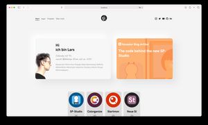
I just finished some redesigning for my website lgk.io.
Before the update:
After the update:
I now use display: grid; to show the latest blog post link next to my introduction card. This way, I waste less space and the user can see more, the links to the featured apps are visible again on the first view. ^^
I also like the new blog post view, I now show the thumbnail image of the post in the background.
Of course the grid view is designed mobile-first. On mobile, the introduction card and the blog post will be just underneath each other.


